R shiny app dashboards in 2021
The Ultimate Guide for Busy People
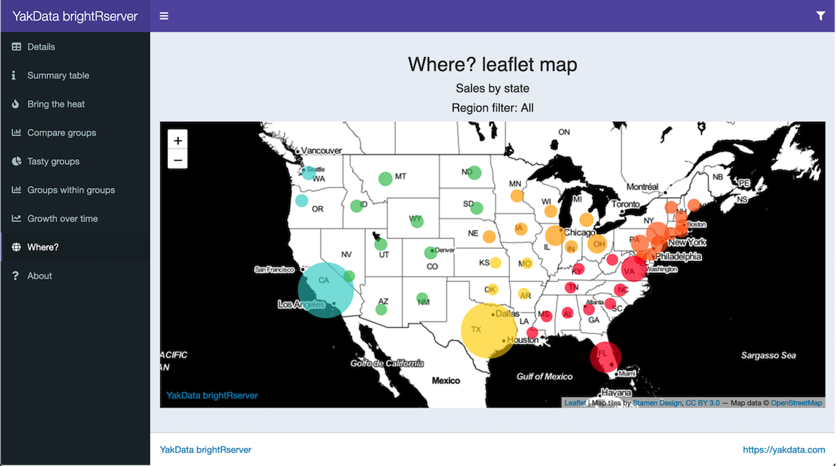
Welcome to a practical guide to help you build professional-grade R shiny app dashboards in 2021. By applying the tips, frameworks, packages and ideas in this guide, you will discover new ways to inform and wow your colleagues and clients with your R shiny app dashboards.
In this guide you’ll find both original content and curated resources to:
- Build R shiny apps from scratch
- Select the optimal dashboard framework for your R shiny app dashboard
- R packages to build interactive, professional-quality data visualizations
- Improve the user experience and dashboard speed tricks
- All the ways you can deploy and share R shiny app dashboards
- Lessons from a dashboard veteran for better R shiny app dashboards
Let’s dive right in.
Table of Contents
Keep learning with us!
R + the web + smarter analyses in our newsletter.
Chapter 1
Build R shiny apps
New to R shiny apps? Start in this section.
An expert? You know that you can always pick up a few new tricks!
Building a quality R shiny app is core to EVERYTHING you do in crafting professional quality R shiny app dashboards.
And in this first step, I’m going to share with you how to create awesome R shiny apps for your team.
What is shiny?
Love your R programs? Want to share them online, complete with dynamic data interaction capabilities? Then the shiny package on CRAN is for you. Start with your handcrafted R program for data access, analyses and graphs. Add the shiny package and you can build a shiny web app in R in minutes. You interact with your R shiny app in your favorite web browser.
What is a shiny app?
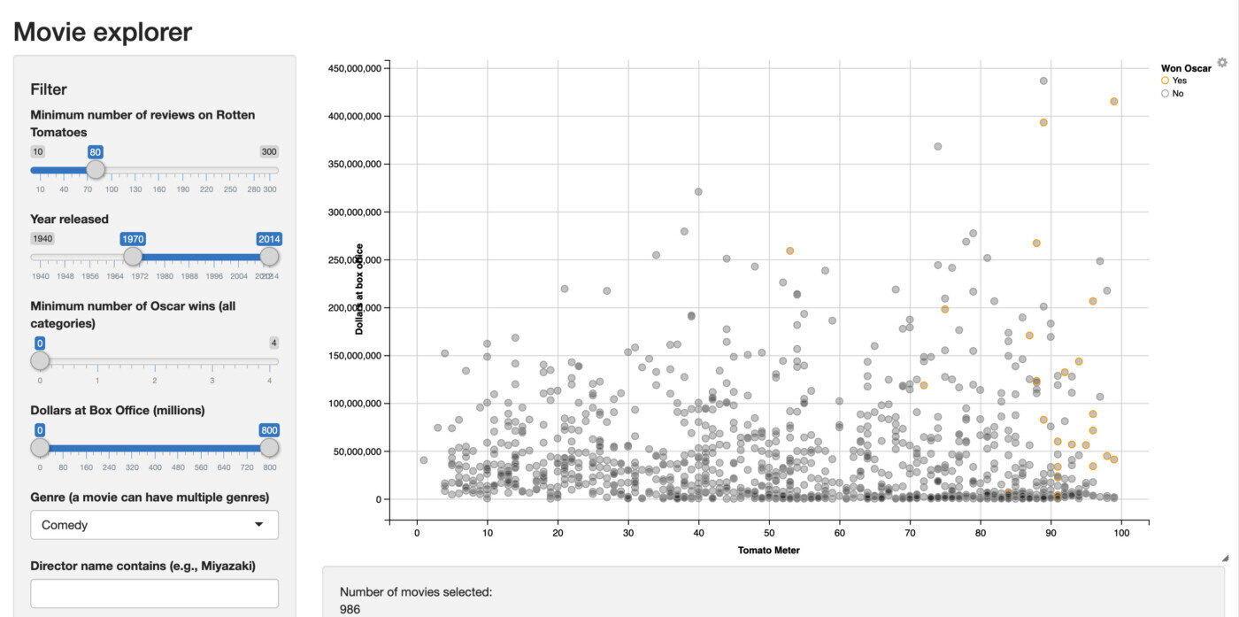
Interact with the sample R shiny app above, hosted on YakData’s cloud servers
A shiny app is an interactive display of data on a web page driven by the statistical power of R. Supported in all modern web browsers, it can be either for personal use or published to a server for sharing with anyone from a small team to the entire world.
Behind the scenes, an R shiny app has a UI (user interface) function and a server function. The UI function describes what data displays to show, what controls will be available and other relevant information like page titles and chart titles. The server function contains modular snippets of your R code to access data, transform data and specify data displays such as maps, charts, graphs and tables to be passed to the UI function. The crucial step: your server function can dynamically react to changes in the control inputs from the UI function. This is how shiny selectively reruns parts of your R code based on user interactions with the web page.
So, your R shiny app audience answers their questions on the spot about the data in your app by interacting with the user interface. The linkage between the user interface and server function is called reactivity, which is basically the display updating based on user interaction with components of the shiny app. These interactions are all programmed by you, the creator of the app.
With your R shiny app, you can display charts, tables, maps and essentially any data display output you build in R. R shiny apps allow you and your team to focus on the analysis results to better understand the signals and nuance in your data.
R shiny apps can be just for personal usage or shared with the team using open-source RStudio Shiny Server, RStudio’s shinyapps.io, YakData’s cloud servers, RStudio’s Shiny Server Pro, RStudio Connect or shinyProxy.
You can embed R shiny apps on a web site using an iframe. This is a simple, widely used method to add them to a corporate web site, a personal blog or hand-crafted web pages.
Interact with a live forecasting R shiny app on YakData’s cloud servers. This example app uses one of the advanced dashboard frameworks, so it is fairly technical.
R shiny tutorials and lessons
Here are four excellent tutorials from expert R users in the wild for learning how to build R shiny apps. If you complete all four, you’ll be prepared to go a long way with the dashboard resources in this Ultimate Guide.
Building Shiny apps – an interactive tutorial
In this in-depth tutorial by Dean Attali, you’ll build an R shiny app that will “… walk through all the steps of building a Shiny app using a dataset that lets you explore the products available at the BC Liquor Store. The final version of the app, including a few extra features that are left as exercises for the reader…”
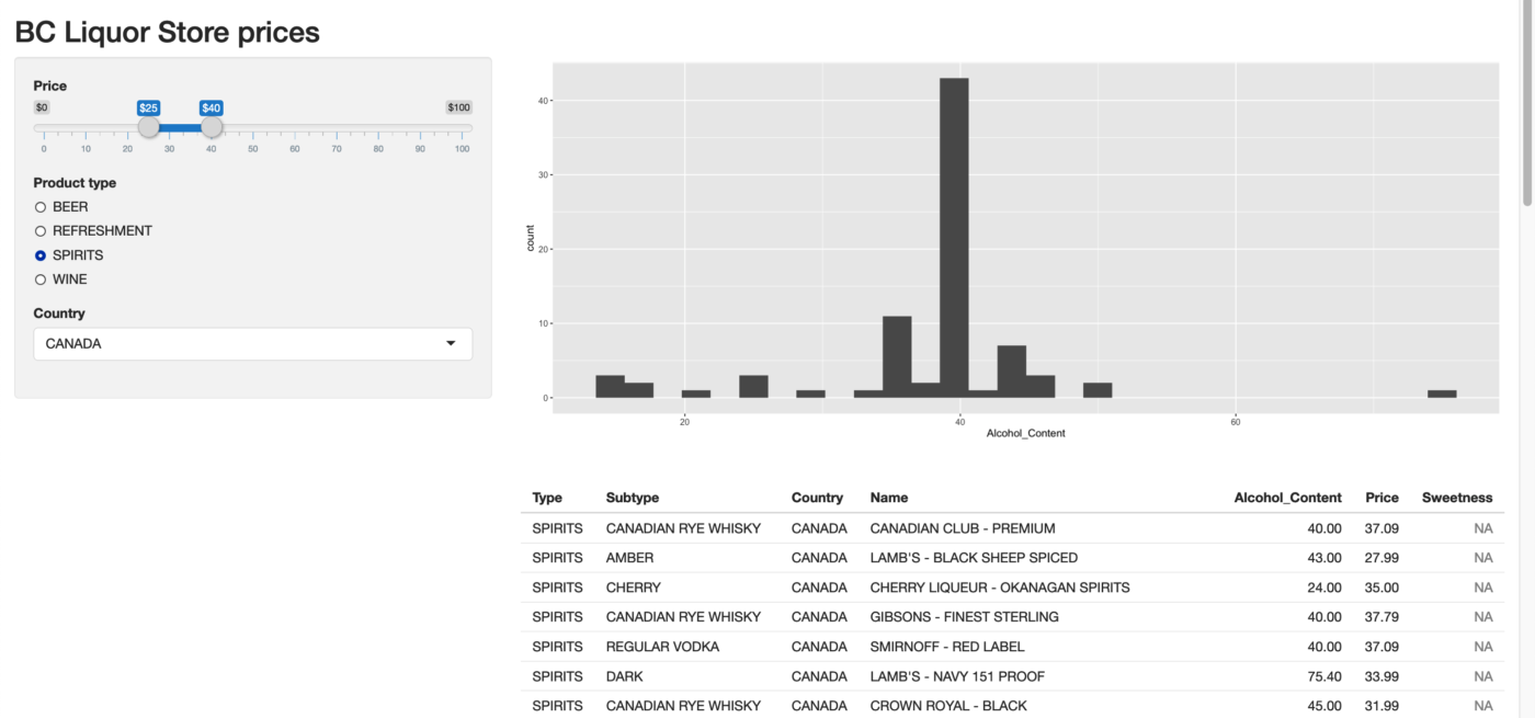
Dean Attali’s interactive tutorial on building R shiny apps
Beginner’s Guide to Creating an R Shiny App
In this tutorial by Yasmine Hejazi of Towards Data Science, you can “create a two-page Shiny application using Mario Kart 8 character data found in Kaggle. The application will consist of an introduction page and a visualization page. In our visualization page, we will build an interactive vertical bar chart where the user can select which variable they would like to see”
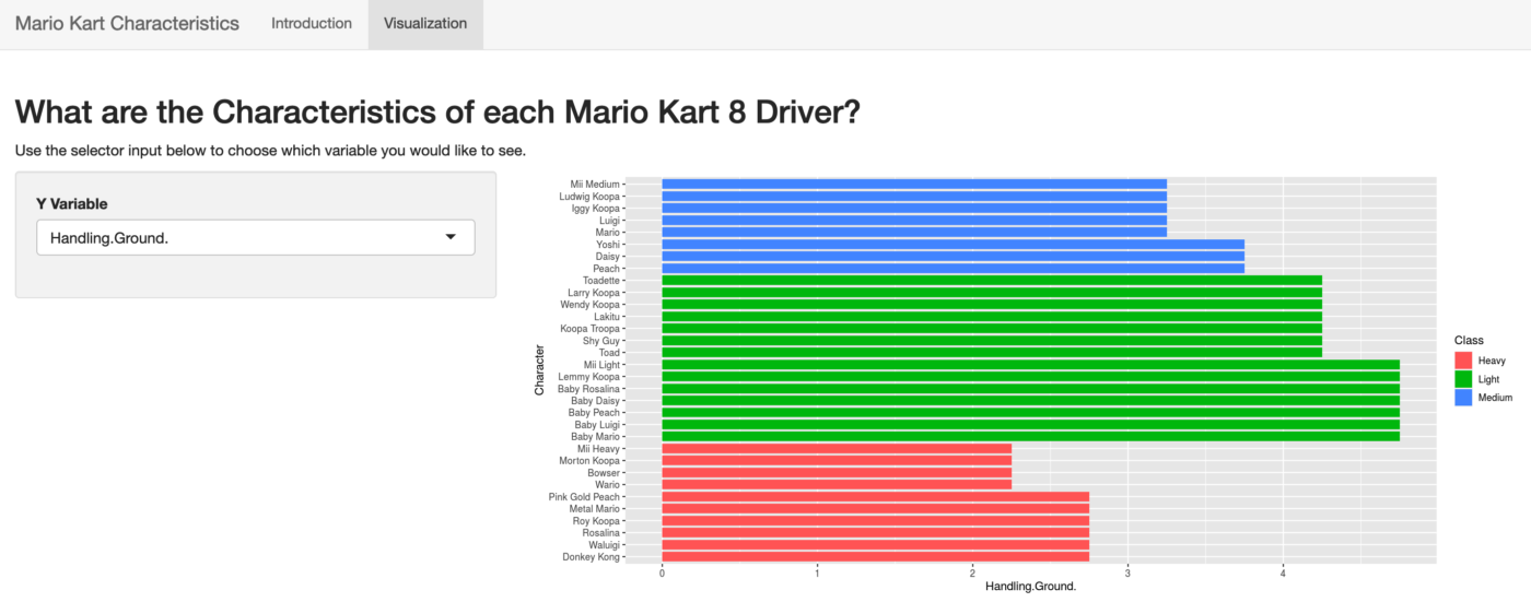
Beginner’s Guide to Creating an R Shiny App by Yasmine Hejazi
From the book, Mastering Shiny, Your first Shiny app
From the book, Mastering Shiny by Hadley Wickham, build your first R shiny app which will show “… you the minimum boilerplate needed for a Shiny app, and then you’ll learn how to start and stop it. Next you’ll learn the two key components of every Shiny app: the UI (short for user interface) which defines how your app looks, and the server function which defines how your app works…“
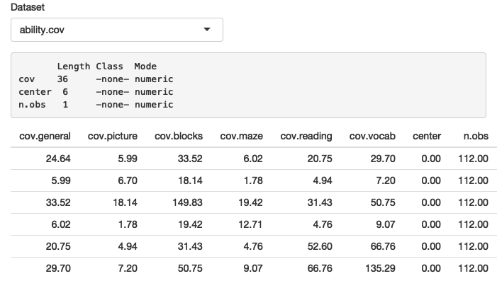
From the book, Mastering Shiny, Your first Shiny app
R Shiny for beginners: annotated starter code
In this tutorial by Martin Henze of Heads or Tails, you’ll construct an R shiny app that “… allows you to choose the number of coin flips as well as the probability for Heads using slider bars. It visualizes the resulting total numbers of Heads vs Tails as a reactive bar plot…”
Understanding shiny reactivity
Reactivity in your R shiny app goes beyond the standard behavior of an R program, which runs from top to bottom in a linear fashion. An R shiny app can have sections that run like a standard R program, in a linear fashion and just once, but it also can have sections that run on-demand based on user interaction with your app on the web page.
Reactivity could be as simple as changing a text string on the web page, like a title of a chart, or could be as intensive as running the original database query that fed every display on the page and running complex analyses on this new query before updating the page charts, graphs and tables.
As the creator of an R shiny app, you determine what controls will appear on the web page. These controls, in turn, determine what inputs can be sent back to the R shiny app program. This is a simplistic way to explain how an R shiny app can “react” to the users desired changes.
Keep in mind that in a production R shiny app, the R session is using resources on your server AND waiting for users to request updates to their currently opened app. So, if you open an exceptionally large data source and keep it open in your server function, that memory is used on your server and not available for other purposes until the app times out from inactivity.
Here are two resources to help you gain a more in-depth understanding of reactivity in your R shiny apps.
Here is a detailed discussion about reactivity at the shinyData blog.
For an in-depth review of reactivity, here is Garrett Grolemund of RStudio on how to understand reactivity in R.
Websites with galleries of R shiny apps
If you are a visual learner like me, seeing a lot of great R shiny app examples may be just the inspiration you need to keep going on your R shiny app odyssey! Browsing galleries of R shiny apps can help you gain a better understanding of what is possible, common design patterns, various appearance themes that are popular and more. Galleries can also be a good way to explain R shiny apps to a less technical audience at your organization.
Here are live, interactive galleries of R shiny apps:
R shiny apps gallery on YakData’s cloud servers.
For a look at some statistical heavy-weight R shiny apps, check out the EU funded TquanT project R shiny app gallery.
Over at Appsilon, they have an impressive range of R shiny app examples in their demo gallery.
Of course, the creators of the shiny package have an in-depth range of examples in the RStudio shiny gallery.
shiny app examples to download and run
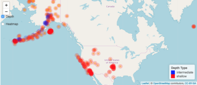
A beautiful example by Joy P. Wyckoff, How to make interactive maps in R Shiny.
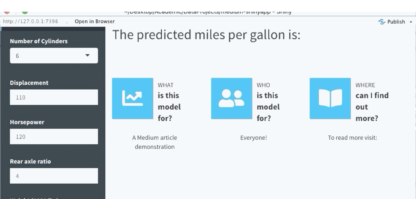
How to Make a Professional-looking Shiny App and Not Get Intimidated (With R) by Lathan Liou.
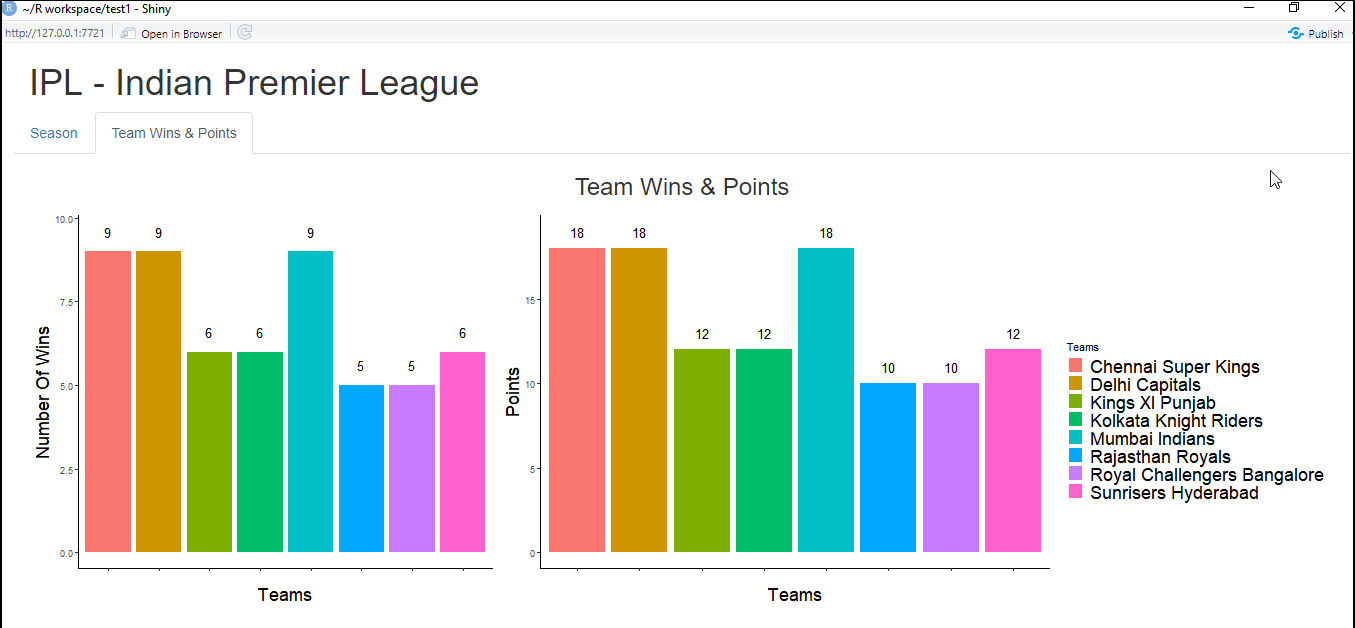
A bright look at sports, An R Shiny Tutorial: All you Need to Know by Cherukuri Sindhu.
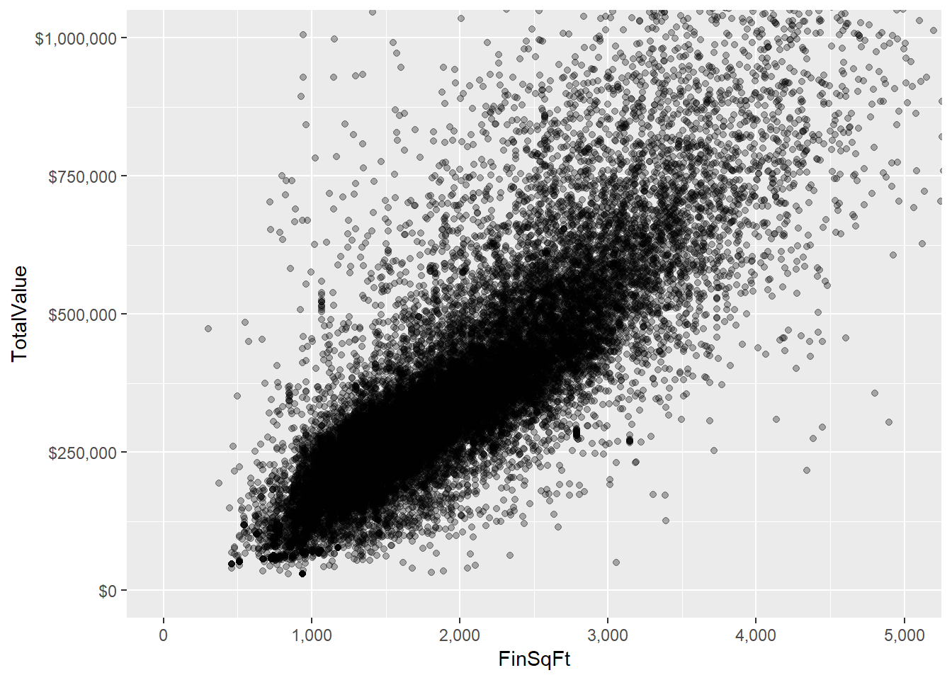
Data Science Ph.D. examples at the UVA Stat Lab, Interactive Visualization and Web Apps with Shiny.
Over 180 shiny examples by RStudio. Almost every detail and nuance of shiny apps has an example app here.
shiny cheat sheet
The original Shiny::cheatsheet by Garrett Gromelund at RStudio.
Great job, now pick your framework!
Chapter 2
Choose a dashboard framework for your R shiny app

So at this point, you should have a solid R shiny app.
And you’re probably wondering: “How do I know which R shiny app dashboard framework to pick?”.
Well, there’s no magic formula that’s going to show you the perfect framework.
But there ARE pros and cons to each framework that you should understand to effectively choose the best R shiny app dashboard framework for your project needs.
That’s exactly what I’m going to cover in this section.
In this review of framework packages, I show:
+ An example screenshot of the framework in use.
+ Background on the framework.
+ The RStudio CRAN ranking of downloads for that package in December 2020.
+ How long each package has been under development.
+ Where you can find the development page of the package.
+ Whether the framework is responsive to smaller screens/screen resizing.
+ And my opinion of the complexity of applying the framework to your R shiny app.
All of these frameworks appear to be under active development, which is a good trait. And all appear to be battle-hardened through multiple releases or a significant number of resolved bugs/issues, enough to be confident of their quality to use in professional-grade projects. Ultimately, your choice may be a mix of preference, practical issues, organization standards and reusability for other projects you may build in 2021 and beyond.
Here is our choice of top R shiny app dashboard frameworks for 2021. The first three in this table are ranked by our preference in project use and the other five options are also great alternatives.
| Framework | CRAN Rank | Relative Download Rank | Years Under Development | Responsive sizing | Complexity to Use |
|---|---|---|---|---|---|
| shinydashboardPlus | 1146 | 3rd | 2018-2020 | Yes | Low |
| shinyMobile | 5595 | 8th | 2016-2020 | Yes | High |
| flexdashboard | 768 | 2nd | 2016-2020 | Somewhat | High |
| argonDash | 1782 | 4th | 2018-2020 | Yes | Medium |
| shinymaterial | 3532 | 7th | 2017-2020 | Yes | Medium |
| semantic.dashboard | 2860 | 6th | 2017-2020 | Yes | Low |
| shinydashboard | 446 | 1st | 2015-2020 | Yes | Low |
| dashboardthemes | 1782 | 5th | 2018-2020 | Yes | Low |
#1 shinydashboardPlus
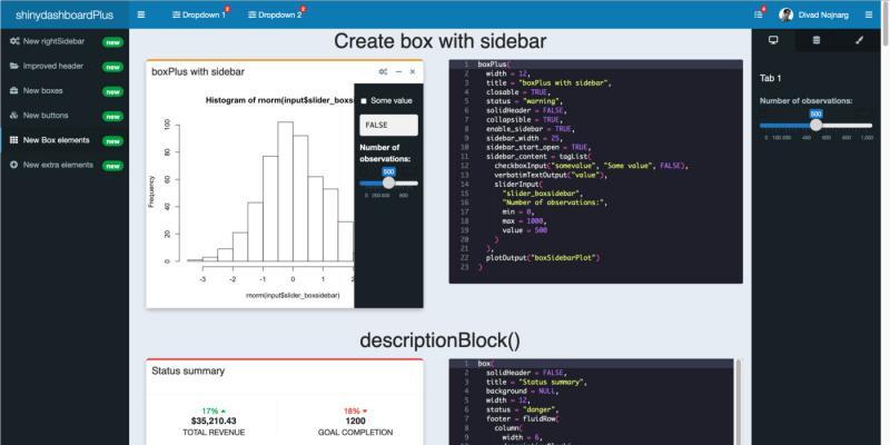
In short, almost any possible display you have seen on an administrative dashboard is likely included here or in the supported shinydashboard package.
CRAN rank 1,146 out of 20,078 (3rd most downloaded)
Development since 2018 through 2020
Find the project at https://github.com/RinteRface/shinydashboardPlus
Responsive? Yes
Complexity of framework – low
#2 shinyMobile
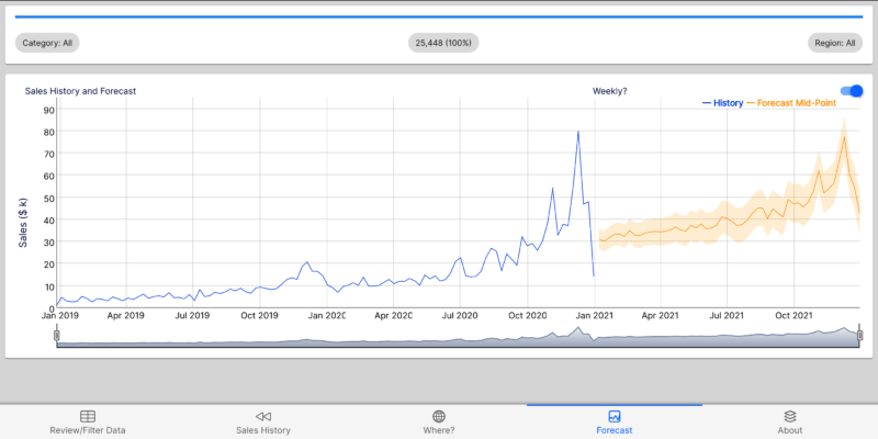
A shinyMobile example, click this image to try a live example on YakData’s cloud servers[/caption]
Develop outstanding R shiny app dashboards for iPhone, iPad, Android devices and the desktop. shinyMobile is built with the latest Framework7 template.
shinyMobile has many great features. Native iOS and Android app frameworks. Mobile app capabilities designed from the ground up to work very well on small screens. Cutting-edge web components that rival professional websites with that “wow” factor. In particular, smart support for mobile-friendly inputs and controls.
While this is my favorite framework for what you can achieve, the level of difficulty is high, which I why I put it in a close 2nd to shinydashboardPlus.
Development since 2016 through 2020
Find the project at https://github.com/RinteRface/shinyMobile/
Responsive? Yes
Complexity of framework – high
#3 flexdashboard
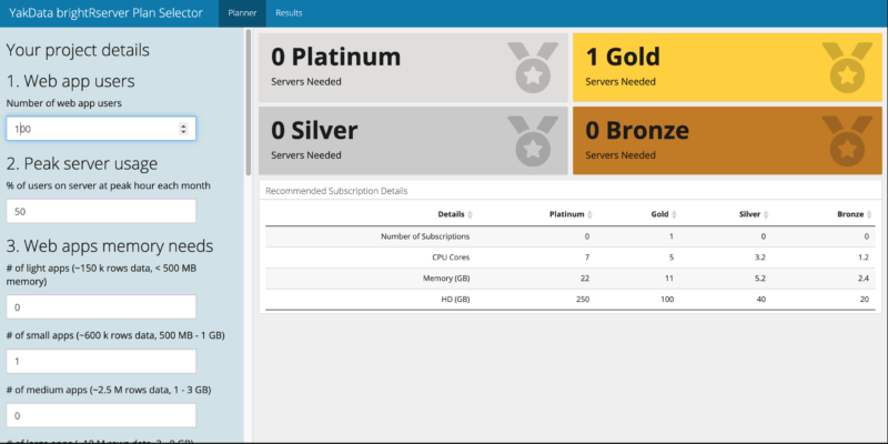
A flexdashboard example, click this image to try a live example on YakData’s cloud servers[/caption]
Development since 2016 through 2020
Find the project at http://rmarkdown.rstudio.com/flexdashboard
Responsive? Yes, to a degree
Complexity of framework – high
Those are my top 3 choices, but here are five more great frameworks and extensions to frameworks for building professional quality dashboards with R shiny apps in 2021.
argonDash
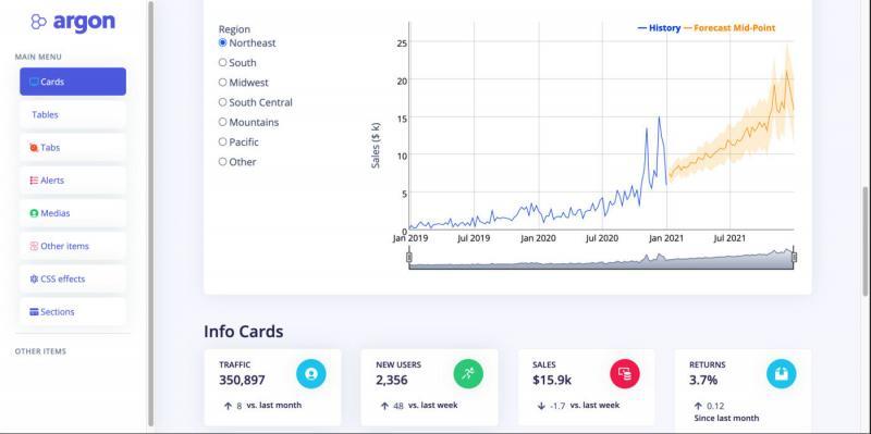
Build slick R shiny app dashboards with the combination of the Bootstrap 4 framework by Twitter combined with the Argon design system by Creative Tim.
Argon has over 100 individual components that are highly customizable. A massive range of web elements is implemented out of the box in Argon. Every web control element has granular specs for colors, styles, hover, focus and more that you can easily access and customize. Argon is a highly interactive, very clean framework with the “wow” factor, which is why I place it at the top of this list for R shiny app dashboards in 2021.
CRAN rank: 1,782 out of 20,078 (4th most downloaded)
Development since 2018 through 2020
Find the project at https://github.com/RinteRface/argonDash
Responsive? Yes
Complexity of framework – Medium
shinymaterial
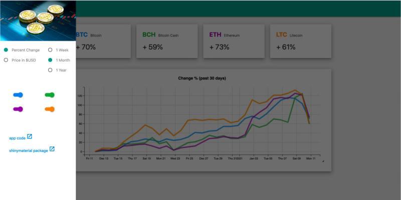
Incorporate Google web UI standards in your R shiny app dashboard. If your organization heavily uses Google business applications (now called Google Workspace), this framework may be for you.
shinymaterial has less “wow factor” and a more minimalist feel out of the box. A strength is active visual feedback as people interact with controls on the page.
Development since 2017 through 2020
Find the project at https://github.com/ericrayanderson/shinymaterial
Responsive? Yes
Complexity of framework – medium
semantic.dashboard
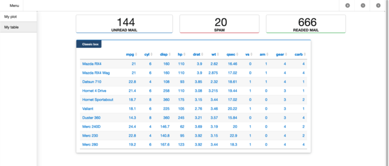
semantic.dashboard offers functions for creating dashboards with a crisp, science journal look and feel. It is based on Fomantic UI, a community fork of Semantic-UI, one of the most popular web frameworks of the last decade with 50,000 GitHub stars.
Development since 2017 through 2020
Find the project at https://github.com/Appsilon/shiny.semantic
Responsive? Yes
Complexity of framework – low
shinydashboard
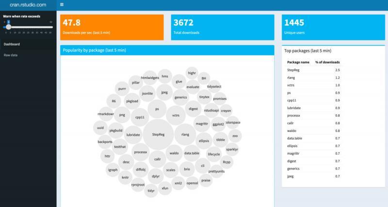
shinydashboard is built on AdminLTE, which is based on Bootstrap 3 by Twitter. Extensive prebuilt components from Bootstrap and powerful JavaScript plugins.
This is the most widely used package for R shiny app dashboards. It is also the package that has been in development the longest in this list.
CRAN rank 446 out of 20,078 (most downloaded on this list)
Development since 2015 through 2020
Find the project at http://rstudio.github.io/shinydashboard/
Responsive? Yes
Complexity of framework – low
dashboardthemes
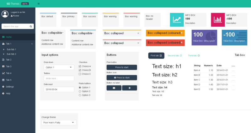
dashboardthemes is an easy but powerful way to fully customize shinydashboard-built R shiny app dashboards. It enhances the shinydashboard framework with easy creation of themes and logos, without knowledge of CSS code. Adds the ability to allow users of your R shiny app dashboards to switch themes within the app.
CRAN rank 1,782 out of 20,078 (5th most downloaded)
Development since 2018 through 2020
Find the project at https://github.com/nik01010/dashboardthemes
Responsive? Yes
Complexity of framework – low
Keep learning with us!
R + the web + smarter analyses in our newsletter.
Wow, now make it useful AND beautiful
Chapter 3
Craft pro-quality data presentation displays
and interactive data visualizations

Researching new alternatives
After years of extensively using R to build amazing graphics in dashboards for clients, I decided to explore the open-source world of JavaScript charts and corresponding R packages.I like to focus more on data analysis rather than the technical details of charts. For that reason, although the “grammar of graphics” in ggplot2 is an ingenious system, I rarely use it. It’s more about the graph and less about the analysis.
Keep in mind, ggplot2 is likely the most widely used graph package in R, so it has a huge following in the R community. You can build stunning data visualizations with this package, but with quite complex code. Examples and tutorials are abundant online for this package.
I attended an R conference years ago at UCLA and was impressed with the ggvis package in a presentation by Hadley Wickham. ggvis was a grammar of graphics approach to the Vega JS framework (which is a smart layer on top of D3) and had some great interactivity possibilities, including graphic rendering in the browser. However, ggvis was experimental at the time and never quite made it to a production release. As a result, I held off on using it in client projects.
Along the way, I discovered several specialized data visualization packages that are excellent, such as dygraphs by JJ Allaire, the founder of RStudio, and the leaflet package for mapping. Both of these are fairly technical to use for a variety of reasons. Regardless, I use them in client projects and am happy with the results.
Eureka! ECharts delivers
So, in my research of innovative, yet approachable JS libraries with supporting R packages, I finally found Apache ECharts. The website states “Apache ECharts is an open-sourced JavaScript visualization tool, which can run fluently on PC and mobile devices. It is compatible with most modern Web Browsers … to create intuitive, interactive, and highly-customizable charts.”After examining the supporting R package by John Coene of Geneva, I was impressed by the possibilities! It’s an open-source project with 50,000 stars on GitHub (!) built around a mature charting library that is concise and analytical. John Coene has made it very accessible with fairly short code snippets capable of creating great data visualizations. Most important to me, the chart defaults are quite good, and the code is much more concise to achieve good results. All while offering extensive customization options, if you choose to put in the extra effort.
Leading-edge tables and charts for 2021
So, as a result of this research, this section is built around just a few packages – echarts4r, leaflet, DT and gt. Since the best description of a package is typically the source, I’ve included quotes from the websites of the creators.
ECharts underpins echarts4r, which provides “… more than 20 chart types available out of the box, along with a dozen components, and each of them can be arbitrarily combined to use. Easily switch between Canvas and SVG rendering. Progressive rendering and stream loading make it possible to render 10 million data in real-time. The default design follows visualization principles, supports responsive design. Flexible configurations make it easy to customize. Automatically generated chart descriptions and decal patterns help users with disabilities understand the content and the stories behind the charts.”
leaflet is based on LeafletJS, “one of the most popular open-source JavaScript libraries for interactive maps”, making “it easy to integrate and control leaflet maps in R.”
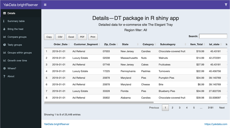
DT is based on DataTables, it is “… an R interface to the JavaScript library DataTables … data frames can be displayed as tables on HTML pages, and DataTables provides filtering, pagination, sorting, and many other features in the tables.”
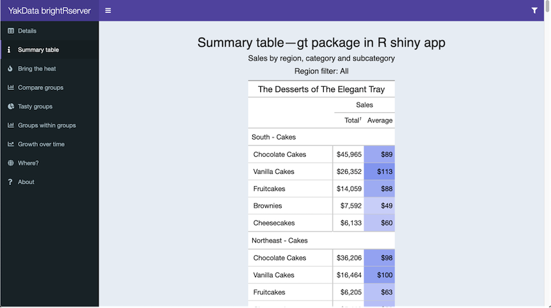
gt allows you to “… make wonderful-looking tables using the R programming language. The gt philosophy: we can construct a wide variety of useful tables with a cohesive set of table parts. These include the table header, the stub, the column labels and spanner column labels, the table body, and the table footer.” The gt package is an abstraction of the grammar of graphics, but for tables. This approach works well with summary table creation in a detailed layout and formatting.
DT handles standard tabular formats quite well, but I recommend gt when you require total control over table layout and appearance. The R gt package is suited to highly formatted, compact tables for critical summaries. The R DT package is appropriate for detailed reviews of large data tables in an interactive, multi-page, user-filterable format.
Want to see these packages in action? Keep reading for examples of essential graph types showcased in an R shiny app on ConnectR, by the YakData team.
Tables – great when looking for exact values
-
Avoid tables if you don’t require exact values or detailed precision – they can be difficult and time-consuming to read and interpret.
-
Use only the metrics you need – too many will clutter the table.
Detailed tables versus summarized tables
-
Tables for detailed, interactive review: DT.
-
Tables as a highly formatted, compact summaries: gt.
Highlight tables – help you quickly find extreme values in your data
-
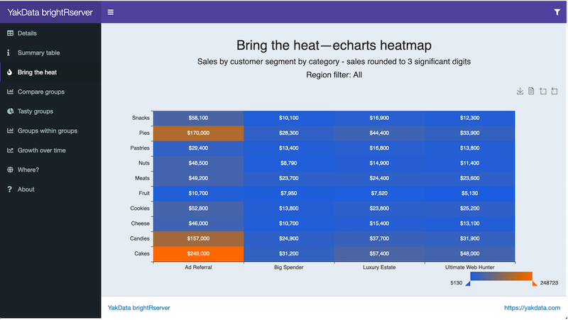
If you are highlighting transactions with errors so that you remember to investigate them, color the cells red when they don’t match, and green when they’re okay – the further off the correct value, the brighter red the color.
-
Keep in mind that about 5% of Americans are color blind, so if there’s a good chance you may be showing your chart to one of them, use shading or a color-blind palette instead.
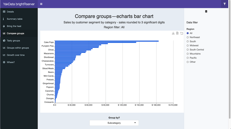
Basic bar charts – make it easy to compare across groups
If you would like to quickly compare a single metric or data item across multiple categories, use a bar chart or bar graph. The value of the metric is represented by the height or length of the bar.
-
If each group has many and/or long labels, a vertical bar chart is often superior. I especially prefer them when ranking is the purpose of the chart.
-
If ranking is key, sort according to the metric of interest.
-
Always include the zero-axis (start at the zero value) for any type of bar chart. If you don’t, the graph will not accurately depict the data, because it will make the differences between the bars look larger than they are.
-
If you have many bars in each pane, consider showing just the top 10 or 20 items by grouping the remaining items into an “Other” category.
-
Resist the temptation to use different colors or shading for each bar unless the colors mean something important. Your audience will be distracted by the colors when they have no particular meaning, directing them away from the overall shape of the data.
Pie charts – quick relative comparisons
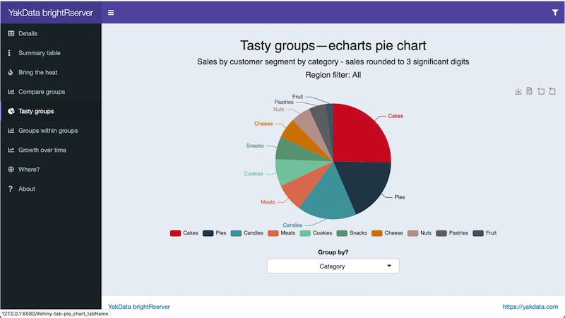
Perhaps you would like to quickly compare a few categories to gain a rough sense of which categories are larger and smaller relative to the combined total for all categories, often called “percentage of the whole” or relative contribution. If the exact numbers are not important, pie charts are a commonly used alternative.
-
Visualization experts have concluded that it is extremely difficult to distinguish the sizes of the slices in pie charts, and they advise against using them. However, they are easy to understand and have been used widely in business for a long time, so they are still a popular graph type in spite of their limitations. Whenever possible, I use bar charts instead of pie charts.
-
If you have more than 6-8 categories, combine smaller categories into an “Other” slice or use a bar chart.
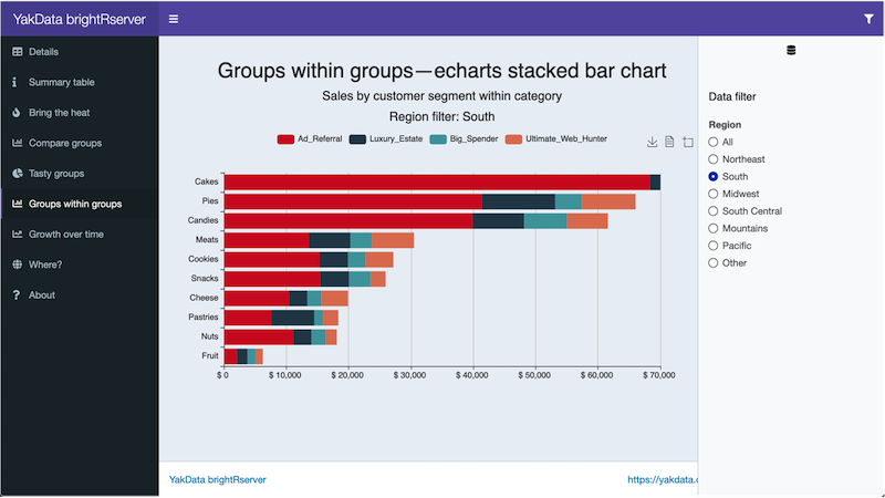
Stacked bar charts – compare across groups and within groups

A stacked bar chart example using echarts4r, click this image to try the live example on YakData ConnectR
If you would like to compare actual values between primary groups, as well as actual values of the secondary grouping within each primary group, use a stacked bar chart.
-
Only stack sums or counts, not averages. Stacking a bunch of averages is not only confusing, but also misleading.
Line charts – look at changes over time
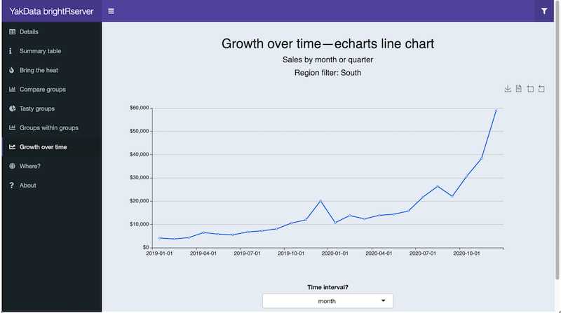
If you would like to investigate how a data item or multiple data items changed over a period of time, use a line chart. These are also referred to as a growth rate chart or time series.
-
Show the zero-axis (start at the zero value). Otherwise, the graph may imply a misleading growth rate, by making it appear that there was a lot of growth or shrinkage, when there wasn’t. The exception to this is if the area of interest is volatile or variable.
-
If the data are highly volatile on a daily basis, instead of showing every data point, average or sum by month for an easier-to-read chart.
-
If you need to know the amount of something to date rather than just individual values, consider using a running total. Year-to-date (YTD) is a typical one.
-
Supplement your map by placing relevant data in another chart type. For instance, you may want to display sales for each state in a table below the map.
More on echarts4r
There are numerous other chart types available with echarts4r. Some of my favorite examples are shown in the gallery below. Visit John Coene’s website, the developer of echarts4r, for these and many more examples, by category: charts, Web GL, statistical charts, maps and geospatial.
So much data, so little time...
Chapter 4
Increase performance and
add JavaScript for a better user experience
Once you have a dashboard that gives the audience the core of what they need to make better decisions, then you can spend time enhancing and perhaps perfecting it! This may be before or after you publish an R shiny app dashboard for production use.
Once you’re certain that you have quality data, solid analytics and great data presentation views, you can then make your valuable R shiny app dashboard truly epic with tips from this chapter.
Now, here are some high-value ways to optimize your R shiny app dashboard experience in 2021.
Data collapse and caching
Incorporating data collapse and caching can mean the audience of your dashboard waits only 1 second instead of 30 seconds for an update, for example.To determine how to do this, ask yourself three questions:
1. What is the minimal data source needed for your dashboard? For instance, can you use only 5 of the source data columns and a summarized format, yet still display what your users need?
2. Can you delay a complete pull of the detailed data until a user clicks on a specific data table view?
3. If you are using a database, are you pushing data collapse/aggregation/column reduction at the earliest part of the data delivery cycle?
One solution I frequently rely upon is the feather package. It provides a very fast, local file storage format for data caching. It is originally from the Apache Arrow project. My experience is that a feather data source versus a CSV or database source can be 2-10X faster to open/requery, depending on the circumstances.
Likewise, reducing the data source size via column selection (select statements in dplyr or even earlier in the data collection cycle) or pre-aggregation can accelerate data access time by another 2-10X.
Note that feather is NOT intended as a long-term storage mechanism, but rather as a data caching format. It is very similar to how memory is kept live on your server computer.
Here is an illustration of data access and caching with feather.
| # From R shiny app dashboards in 2021: The Ultimate Guide for Busy People at | |
| # https://yakdata.com/ultimate-guide-r-shiny-app-dashboards-2021/ | |
| # | |
| # Example for chapter 4 | |
| # Here is an illustration of data access and caching with feather | |
| # | |
| # Stephen McDaniel at YakData | |
| # Released under the MIT License, 2021 | |
| library(feather) | |
| library(readr) | |
| library(dplyr) | |
| file_path <- "/Development/R-code-examples/Data_Analysis/" | |
| setwd(file_path) | |
| feather_file <- "sales_analyze3.feather" | |
| # check the age of our data file for this dashboard | |
| file_age_hours <- function(filepath) { | |
| if(!exists(filepath)) { | |
| # if it doesn't exist, infinity | |
| return(Inf) | |
| } else { | |
| file_modified <- file.info(feather_file)$mtime | |
| file_age_hours <- floor((as.numeric(Sys.time()) - as.numeric(file_modified))/(60*60)*10)/10 | |
| return(file_age_hours) | |
| } | |
| } | |
| if (file_age_hours(feather_file) > 24) { | |
| # older than 24 hours, recreate cached data | |
| sales_analyze <- as_tibble(readRDS("sales_analyze_geo_elegant_tray2.RDS")) %>% | |
| select( | |
| Order_Date, | |
| Customer_Segment, | |
| State, | |
| Category, | |
| Subcategory, | |
| Item_Total, | |
| State_Name, | |
| lat_state, | |
| long_state | |
| ) %>% | |
| mutate(State_Abbrev = State, | |
| State = State_Name, | |
| metric = Item_Total) %>% | |
| select(-State_Name) %>% | |
| mutate(Order_Date = as.Date(Order_Date)) %>% | |
| mutate(Region = ifelse( | |
| State_Abbrev %in% c( | |
| "NJ", "MA", "PA", "MD", "DE", "CT", "NY", "NH", "ME", "VT", "DC", "RI" | |
| ), | |
| "Northeast", | |
| ifelse( | |
| State_Abbrev %in% c("FL", "AL", "TN", "MS", "SC", "GA", "VA", "NC", "WV", "KY", "LA"), | |
| "South", | |
| ifelse( | |
| State_Abbrev %in% c("OH", "IA", "WI", "IL", "IN", "MI", "MN", "NE"), | |
| "Midwest", | |
| ifelse( | |
| State_Abbrev %in% c("MO", "KS", "OK", "TX", "AR"), | |
| "South Central", | |
| ifelse( | |
| State_Abbrev %in% c("WY", "ID", "AZ", "NM", "NV", "CO", "UT", "ND", "SD", "MT"), | |
| "Mountains", | |
| ifelse( | |
| State_Abbrev %in% c("CA", "AK", "WA", "HI", "OR"), | |
| "Pacific", | |
| "Other" | |
| ) | |
| ) | |
| ) | |
| ) | |
| ) | |
| ) | |
| ) | |
| # larger data frames can benefit from the feather format | |
| save_feather(sales_analyze, "sales_analyze3.feather") | |
| chart_data <- sales_analyze %>% | |
| group_by(Category, Subcategory, Customer_Segment, Region) %>% | |
| summarise(metric = sum(metric)) %>% | |
| ungroup() | |
| # smaller data frames have minimal benefit from feather format | |
| save_rds(chart_data, "chart_data.RDS") | |
| } else { | |
| sales_analyze <- read_feather("sales_analyze3.feather") | |
| chart_data <- read_rds(chart_data, "chart_data.RDS") | |
| } |
Smarter flow, messages and new tricks with JavaScript/jQuery
shinyjs is the preferred way to enhance your R shiny app dashboard with additional interactive capabilities in the browser. shinyjs simplifies the addition of JavaScript/jQuery operations to your dashboard.
Examples of what you can do with shinyjs include:
+ Hide or show an element on the page.
+ Disable or enable inputs.
+ Change/restore the value of an input.
+ Delay code execution.
+ Run JavaScript code on page load.
+ Create and execute on-demand your own JavaScript functions from the R server function in your shiny app.
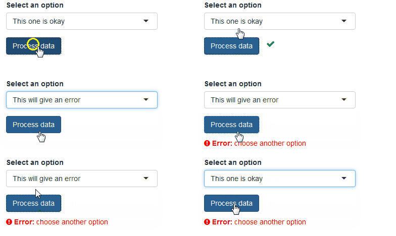
A great tutorial to learn the core of shinyjs is at the package author’s website, Dean Attali. An example of advanced user feedback messages is shown below.
Every production R shiny app dashboard that I have developed has used JavaScript enhancements, usually with the use of shinyjs. On occasion, I had simpler needs that could be fulfilled with standard methods to add JavaScript to shiny apps without the addition of the shinyjs package.
One last consideration is building shiny apps with external HTML templates. Dean Attali has instructions on using shinyjs in this configuration. This can be quite time-consuming but allows the embedding of shiny capabilities with your web development standards.
![]()
![]()
![]()
By embedding your R shiny app dashboard as part of larger web development projects, amazing concepts can be achieved from a user workflow, data-sharing and dynamic feedback perspective in complex web/data/organizational environments. I have integrated R shiny apps with Vue.js web platforms using the HTML template approach. The results were indeed impressive. React JS and AngularJS integration/working in parallel with R shiny app dashboards is also possible.
Subscribe to our newsletter
Why build it if you don't share it?
Chapter 5
Deploy and share R shiny app dashboards
Content publishing is a SUPER important part of the R shiny app dashboard lifecycle. Why make it if you don’t share it?
In my experience, most people use the “Publish and Pray” approach to R shiny app dashboards. In other words, they publish a piece of content… and hope that people find value in it.
The truth is that you will likely need to update your dashboard a few times over the first few months. Your view of how to display the data won’t always coincide with the way that your dashboard consumers use the data to answer their questions.So, let’s get that R shiny app dashboard out there and start getting value and feedback from our users! Here are some of the best ways to publish and share R shiny app dashboards.
1. RStudio Desktop
Note that this option is impractical unless you have a coordinated team of RStudio users, who only need access to the R shiny app dashboard when they can access their computer AND the network on which the data resides AND can keep their package environments in synch.
2. Open source Shiny Server
Open source Shiny Server makes R shiny apps available online. The downsides? Your team installs and maintains the server and server software. Most importantly, no security is implemented to manage access to the published shiny apps. So anyone with the network address to the server can browse and run any app on it.
This is a great option for apps that you wish to make public or put inside your internal firewall for the entire organization to share.
3. RStudio shinyapps.io
Share your shiny applications online in minutes. A cloud-deployed, user-ready alternative with an hour-based metering system for app usage. When your app runs, it runs on a dynamically deployed AWS server and continues running for 15 minutes past the last user request. This is roughly how hours used are calculated.
From a free plan without user security to multiple higher-end secured plans, this is a good option for projects. One of the main restrictions versus other options in this list is a lack of persistent data storage on the server.
4. YakData ConnectR
Publish R shiny apps on ConnectR with secured access for specific users or groups. Colleagues log in using their favorite web browser and open the app to view and interact with their data. R Markdown documents are also supported, including flexdashboard.
Create, edit, test and debug R shiny apps with ConnectR Editor, a secured version of the most popular open-source editor for R. Easily upload existing R shiny apps via the Secure FTP server. More than 2,000 of the most popular R packages are pre-installed on ConnectR. Need other packages? You can install them from MRAN, CRAN, GitHub or uploaded files. Upload and download file-based data sources via the SFTP server and define remote data sources with specialized R packages.
Launch your R shiny app project today in minutes from one of 14 locations worldwide and eliminate the hassle of maintenance and upgrades with a hosted ConnectR. Experience high frequency computes performance with ultra-fast on-server storage. Data consumers and data expert teams can get back to making the most of your analysis on ConnectR. No worries about vendor lock-in as your R shiny apps published on ConnectR can be migrated to several open source and proprietary alternatives.
5. RStudio Shiny Server Pro (now RStudio Connect)
Built by the same team and upon open source Shiny Server, this option appears to have merged into RStudio Connect. The old web page no longer has any content beyond a logo.
6. Shiny Proxy
Deploy Shiny apps in an enterprise context. It has built-in functionality for LDAP authentication and authorization. Your team installs and maintains the server and server software.
7. RStudio Connect
A publishing platform for Python and R content. You can share shiny apps, R Markdown documents, Plumber APIs and Jupyter Notebooks.
It is integrated with the RStudio IDE and allows scheduled execution of content in a secured environment. Your team installs and maintains the server and server software.
If you build it, will they come?
Is it useful? Relevant? Timely?
Audience-appropriate? Trusted?
Chapter 6
Build first-rate R shiny app dashboards:
lessons from a dashboard veteran
+ The ultimate purpose of the dashboard.
+ The details that the audience will be looking for to find solutions to their business challenges.
+ How to make exciting dashboards that people will love using and sharing.
If you save people’s time and make them smarter about their business, leading to higher profits, you will become very popular! But remember that it’s a journey – the more your practice these simple checks on your work, the better you’ll be as an R shiny dashboard designer.
1. What is the overall purpose?
2. Understand specific business goals
3. Identify the minimum data elements required
4. Tips for dashboards that are:
+ Strategic in nature, and
+ Analytical or tactical in nature
Here is a compact version of some of the methodology I have learned building dashboards over the past two decades. First, there is “no one size fits all” set of rules. There is an incredibly diverse world of possible dashboard applications, but this rough collection of hard-learned tips should help you vastly improve dashboard success in your organization.
1. What is the overall purpose of the dashboard?
Typically, at this stage, you were approached by a manager or colleague with a request to build a dashboard. Alternatively, you may have come up with the idea on your own if you recognized an opportunity to help the business move forward using data.Before you even start building your dashboard, the question you should ask yourself is “Why this dashboard?” Write down 1-3 general questions. Engage with your colleagues to discuss and synthesize concise answers.
2. Understand the specific business goals
After you figure out the core purpose of your dashboard, compile the specific business goals that your team seeks to accomplish. Reading reports that are currently in use is a good source of information. Speaking with top users of these reports to understand what they do with them can be a surprising and good guidance for data analyses that will be most useful to dashboard consumers.Match these goals to key questions and which data would best answer them. I suggest that you initially ignore the data you’ve always used or have conveniently available to you and be open to the possibility of obtaining new data that you haven’t thought of before. Sometimes it’s easier to get than you think! These findings can be the difference between popular and rarely used dashboards.
3. Identify the minimum data elements required
Now try to pair the questions the dashboard must answer with the most critical data elements required to answer them. Including only what is necessary simplifies all aspects of building, maintaining and utilizing the dashboard. You can always add and enrich the data for a popular dashboard, but if you miss the mark with early versions, no one will care if you have a huge range of data display/data analysis options.If there is crucial data that is missing, sketch out a rough plan to capture and incorporate these data sources over time. Verify these once again with expert users of these data sources in your organization.
4. Strategic versus analytic dashboards
Strategic dashboards
Strategic dashboards help your dashboard audience plan for the long-term operation of the business. For this audience, simple is frequently better.Of course, the definition of “simple” varies by audience! Colleagues will typically look at these dashboards every few weeks or months. These should be easy to interpret, so stick with clear messages and simpler data visualization methods. Ensure that your dashboard aligns what you show with strategic priorities set by top-level leadership in your organization.
For clarity, it can be useful to show targets or simple trends. The chart types that tend to work best here are bar charts, line charts or bullet graphs. Limit interactivity, usually to clearly identifiable filters, and consider adding automated filtering based on the user interacting with the dashboard (e.g., worldwide executive viewing the dashboard versus the European executive viewing the dashboard.)
In a strategic dashboard, slower query times are unacceptable, so schedule or aggregate data as needed. Daily or weekly data pulls and pre-aggregation typically work for strategic dashboard audiences.
Analytic dashboards
Dashboards built for analytic or tactical reasons are often of a higher complexity compared to strategic ones. These are used daily or weekly by people dedicated to certain roles in an organization, such as marketing analysts, financial analysts, logistics planners or engineering teams.Analytic dashboards can incorporate a greater range of metrics and higher levels of anticipated user interactivity, including user willingness to use interactive chart/data table features that aren’t readily apparent to the casual user.
The ability to drill down on the data for detailed exploration is critical for this class of dashboards. Analysts must be able to launch ad-hoc analysis from the dashboard. So consider a data download/data connection option for end-users – possibly at the aggregate level in the dashboard and ideally at the original data feed level. With analytic dashboards, slower query times may be acceptable but are not desirable. Due to the exploratory nature that users require in these dashboards, there may be fewer data aggregation opportunities to enhance performance, but there are likely still some areas for optimization after the first dashboard version is released.
Subscribe to our newsletter


