


What is shiny?
Love your R programs? Want to share them online, complete with dynamic data interaction capabilities? Then the shiny package on CRAN is for you. Start with your handcrafted R program for data access, analyses and graphs. Add the shiny package and you can build a shiny web app in R in minutes. You interact with your R shiny app in your favorite web browser.
What is a shiny app?
Interact with the sample R shiny app above, hosted on YakData’s cloud servers
A shiny app is an interactive display of data on a web page driven by the statistical power of R. Supported in all modern web browsers, it can be either for personal use or published to a server for sharing with anyone from a small team to the entire world.
Behind the scenes, an R shiny app has a UI (user interface) function and a server function. The UI function describes what data displays to show, what controls will be available and other relevant information like page titles and chart titles. The server function contains modular snippets of your R code to access data, transform data and specify data displays such as maps, charts, graphs and tables to be passed to the UI function. The crucial step: your server function can dynamically react to changes in the control inputs from the UI function. This is how shiny selectively reruns parts of your R code based on user interactions with the web page.
So, your R shiny app audience answers their questions on the spot about the data in your app by interacting with the user interface. The linkage between the user interface and server function is called reactivity, which is basically the display updating based on user interaction with components of the shiny app. These interactions are all programmed by you, the creator of the app.
With your R shiny app, you can display charts, tables, maps and essentially any data display output you build in R. R shiny apps allow you and your team to focus on the analysis results to better understand the signals and nuance in your data.
R shiny apps can be just for personal usage or shared with the team using open-source RStudio Shiny Server, RStudio’s shinyapps.io, YakData’s cloud servers, RStudio’s Shiny Server Pro, RStudio Connect or shinyProxy.
You can embed R shiny apps on a web site using an iframe. This is a simple, widely used method to add them to a corporate web site, a personal blog or hand-crafted web pages.
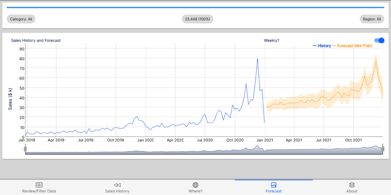
Interact with a live forecasting R shiny app on YakData’s cloud servers. This example app uses one of the advanced dashboard frameworks, so it is fairly technical.

The YakData’s cloud servers mobile-friendly forecaster app – Forecast tab
R shiny tutorials and lessons
Here are four excellent tutorials from expert R users in the wild for learning how to build R shiny apps. If you complete all four, you’ll be prepared to go a long way with the dashboard resources in this Ultimate Guide.
Building Shiny apps – an interactive tutorial
In this in-depth tutorial by Dean Attali, you’ll build an R shiny app that will “… walk through all the steps of building a Shiny app using a dataset that lets you explore the products available at the BC Liquor Store. The final version of the app, including a few extra features that are left as exercises for the reader…”
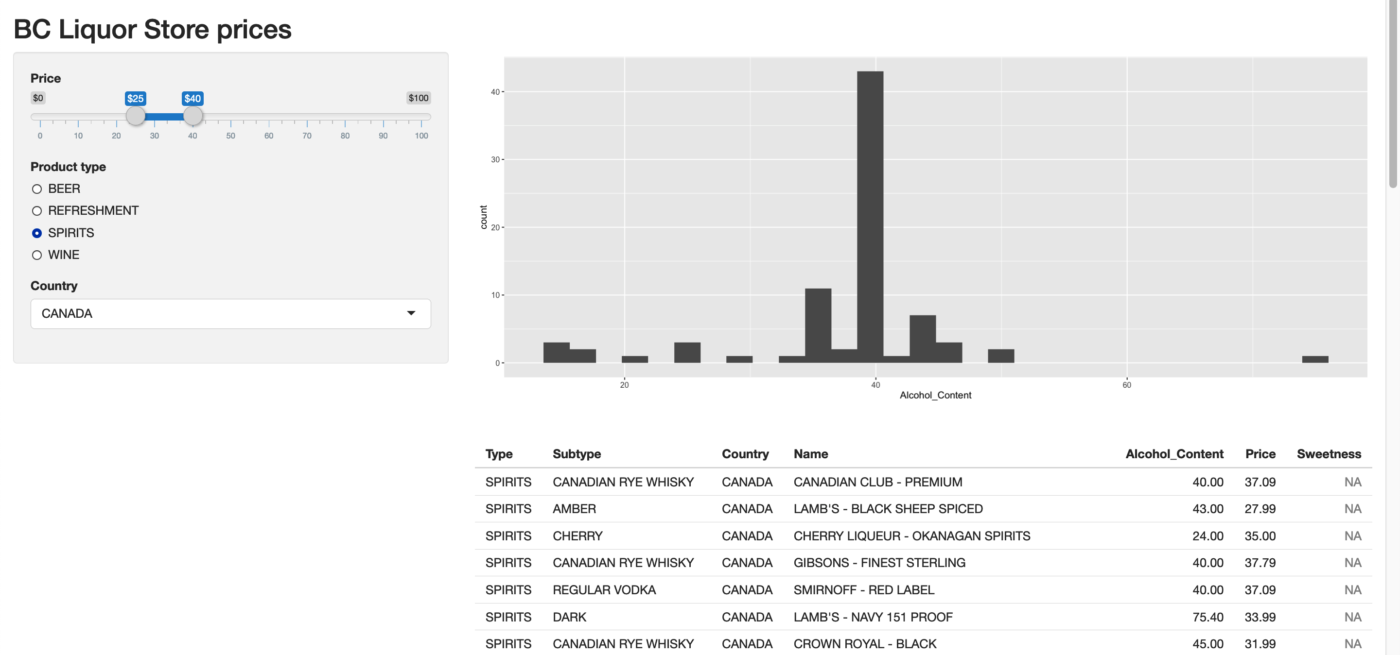
Dean Attali’s interactive tutorial on building R shiny apps
Beginner’s Guide to Creating an R Shiny App
In this tutorial by Yasmine Hejazi of Towards Data Science, you can “create a two-page Shiny application using Mario Kart 8 character data found in Kaggle. The application will consist of an introduction page and a visualization page. In our visualization page, we will build an interactive vertical bar chart where the user can select which variable they would like to see”
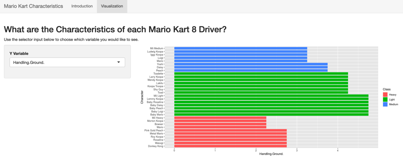
Beginner’s Guide to Creating an R Shiny App by Yasmine Hejazi
From the book, Mastering Shiny, Your first Shiny app
From the book, Mastering Shiny by Hadley Wickham, build your first R shiny app which will show “… you the minimum boilerplate needed for a Shiny app, and then you’ll learn how to start and stop it. Next you’ll learn the two key components of every Shiny app: the UI (short for user interface) which defines how your app looks, and the server function which defines how your app works…“
From the book, Mastering Shiny, Your first Shiny app
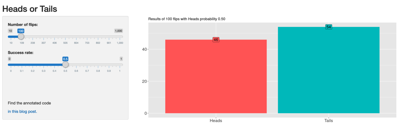
R Shiny for beginners: annotated starter code
In this tutorial by Martin Henze of Heads or Tails, you’ll construct an R shiny app that “… allows you to choose the number of coin flips as well as the probability for Heads using slider bars. It visualizes the resulting total numbers of Heads vs Tails as a reactive bar plot…”
Understanding shiny reactivity
Reactivity in your R shiny app goes beyond the standard behavior of an R program, which runs from top to bottom in a linear fashion. An R shiny app can have sections that run like a standard R program, in a linear fashion and just once, but it also can have sections that run on-demand based on user interaction with your app on the web page.
Reactivity could be as simple as changing a text string on the web page, like a title of a chart, or could be as intensive as running the original database query that fed every display on the page and running complex analyses on this new query before updating the page charts, graphs and tables.
As the creator of an R shiny app, you determine what controls will appear on the web page. These controls, in turn, determine what inputs can be sent back to the R shiny app program. This is a simplistic way to explain how an R shiny app can “react” to the users desired changes.
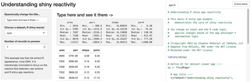
Understanding R shiny app reactivity, click on this image to try it live on YakData’s cloud servers
Keep in mind that in a production R shiny app, the R session is using resources on your server AND waiting for users to request updates to their currently opened app. So, if you open an exceptionally large data source and keep it open in your server function, that memory is used on your server and not available for other purposes until the app times out from inactivity.
Here are two resources to help you gain a more in-depth understanding of reactivity in your R shiny apps.
Here is a detailed discussion about reactivity at the shinyData blog.
For an in-depth review of reactivity, here is Garrett Grolemund of RStudio on how to understand reactivity in R.
Websites with galleries of R shiny apps
If you are a visual learner like me, seeing a lot of great R shiny app examples may be just the inspiration you need to keep going on your R shiny app odyssey! Browsing galleries of R shiny apps can help you gain a better understanding of what is possible, common design patterns, various appearance themes that are popular and more. Galleries can also be a good way to explain R shiny apps to a less technical audience at your organization.
Here are live, interactive galleries of R shiny apps:
R shiny apps gallery on YakData’s cloud servers.
For a look at some statistical heavy-weight R shiny apps, check out the EU funded TquanT project R shiny app gallery.
Over at Appsilon, they have an impressive range of R shiny app examples in their demo gallery.
Of course, the creators of the shiny package have an in-depth range of examples in the RStudio shiny gallery.
shiny app examples to download and run
A beautiful example by Joy P. Wyckoff, How to make interactive maps in R Shiny.
How to Make a Professional-looking Shiny App and Not Get Intimidated (With R) by Lathan Liou.
A bright look at sports, An R Shiny Tutorial: All you Need to Know by Cherukuri Sindhu.
Data Science Ph.D. examples at the UVA Stat Lab, Interactive Visualization and Web Apps with Shiny.
Over 180 shiny examples by RStudio. Almost every detail and nuance of shiny apps has an example app here.
shiny cheat sheet
The original Shiny::cheatsheet by Garrett Gromelund at RStudio.
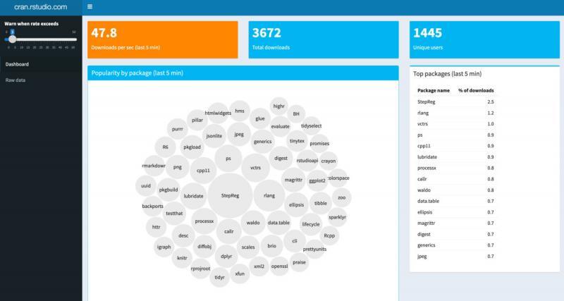
#1 shinydashboardPlus
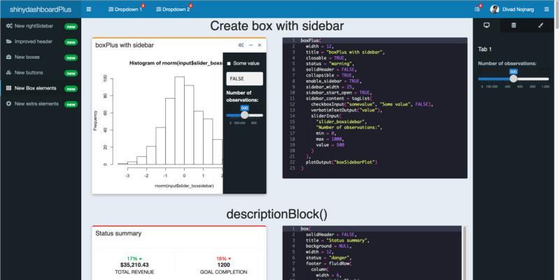
A shinydashboardPlus example, click this image to try a live example on YakData’s cloud servers
An easy but powerful way to add many additional capabilities to shinydashboard-built R shiny app dashboards. It enhances the shinydashboard framework with a right sidebar, additional left-side header controls, multiple new box controls including a flipbox and widgetbox, new buttons for apps and social media, new box elements including sidebars, accordions and timelines and progress bars and image carousels.
In short, almost any possible display you have seen on an administrative dashboard is likely included here or in the supported shinydashboard package.
CRAN rank 1,146 out of 20,078 (3rd most downloaded)
Development since 2018 through 2020
Find the project at https://github.com/RinteRface/shinydashboardPlus
Responsive? Yes
Complexity of framework – low
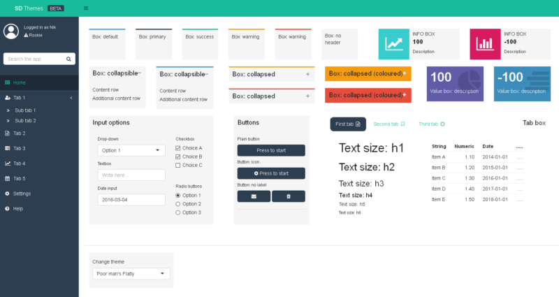
A shinyMobile example, click this image to try a live example on YakData’s cloud servers[/caption]
Develop outstanding R shiny app dashboards for iPhone, iPad, Android devices and the desktop. shinyMobile is built with the latest Framework7 template.
shinyMobile has many great features. Native iOS and Android app frameworks. Mobile app capabilities designed from the ground up to work very well on small screens. Cutting-edge web components that rival professional websites with that “wow” factor. In particular, smart support for mobile-friendly inputs and controls.
While this is my favorite framework for what you can achieve, the level of difficulty is high, which I why I put it in a close 2nd to shinydashboardPlus.
A flexdashboard example, click this image to try a live example on YakData’s cloud servers[/caption]
In short, almost any possible display you have seen on an administrative dashboard is likely included here or in the supported shinydashboard package.
CRAN rank 1,146 out of 20,078 (3rd most downloaded)
Development since 2018 through 2020
Find the project at https://github.com/RinteRface/shinydashboardPlus
Responsive? Yes
Complexity of framework – low
#2 shinyMobile
A shinyMobile example, click this image to try a live example on YakData’s cloud servers[/caption]
Develop outstanding R shiny app dashboards for iPhone, iPad, Android devices and the desktop. shinyMobile is built with the latest Framework7 template.
shinyMobile has many great features. Native iOS and Android app frameworks. Mobile app capabilities designed from the ground up to work very well on small screens. Cutting-edge web components that rival professional websites with that “wow” factor. In particular, smart support for mobile-friendly inputs and controls.
While this is my favorite framework for what you can achieve, the level of difficulty is high, which I why I put it in a close 2nd to shinydashboardPlus.
CRAN rank: 5,595 out of 20,078 (8th most downloaded)
Development since 2016 through 2020
Find the project at https://github.com/RinteRface/shinyMobile/
Responsive? Yes
Complexity of framework – high
Development since 2016 through 2020
Find the project at https://github.com/RinteRface/shinyMobile/
Responsive? Yes
Complexity of framework – high
#3 flexdashboard
A flexdashboard example, click this image to try a live example on YakData’s cloud servers[/caption]
You can use flexdashboard to create static (no timeouts!) web pages or dynamic R shiny app dashboards. flexdashboard converts an R Markdown document to a grid-oriented dashboard. The dashboard is flexible, adapting the size of its components to the containing web page.
The storyboards feature provides an alternative to the standard “grid layout.” These can be used to present a series of data visualizations with text commentary in a “flow” for your data consumers.
CRAN rank 768 out of 20,078 (2nd most downloaded)
Development since 2016 through 2020
Find the project at http://rmarkdown.rstudio.com/flexdashboard
Responsive? Yes, to a degree
Complexity of framework – high
Development since 2016 through 2020
Find the project at http://rmarkdown.rstudio.com/flexdashboard
Responsive? Yes, to a degree
Complexity of framework – high
Those are my top 3 choices, but here are five more great frameworks and extensions to frameworks for building professional quality dashboards with R shiny apps in 2021.
argonDash
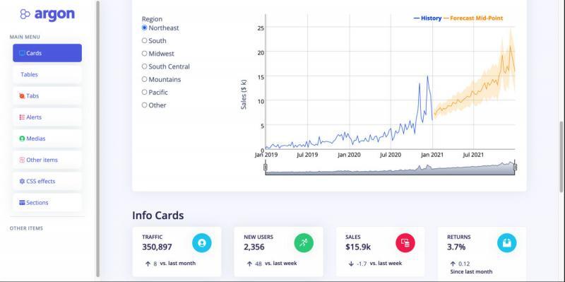
Build slick R shiny app dashboards with the combination of the Bootstrap 4 framework by Twitter combined with the Argon design system by Creative Tim.
Argon has over 100 individual components that are highly customizable. A massive range of web elements is implemented out of the box in Argon. Every web control element has granular specs for colors, styles, hover, focus and more that you can easily access and customize. Argon is a highly interactive, very clean framework with the “wow” factor, which is why I place it at the top of this list for R shiny app dashboards in 2021.
CRAN rank: 1,782 out of 20,078 (4th most downloaded)
Development since 2018 through 2020
Find the project at https://github.com/RinteRface/argonDash
Responsive? Yes
Complexity of framework – Medium
shinymaterial
Incorporate Google web UI standards in your R shiny app dashboard. If your organization heavily uses Google business applications (now called Google Workspace), this framework may be for you.
shinymaterial has less “wow factor” and a more minimalist feel out of the box. A strength is active visual feedback as people interact with controls on the page.
CRAN rank 3,532 out of 20,078 (7th most downloaded)
Development since 2017 through 2020
Find the project at https://github.com/ericrayanderson/shinymaterial
Responsive? Yes
Complexity of framework – medium
Development since 2017 through 2020
Find the project at https://github.com/ericrayanderson/shinymaterial
Responsive? Yes
Complexity of framework – medium
semantic.dashboard
semantic.dashboard offers functions for creating dashboards with a crisp, science journal look and feel. It is based on Fomantic UI, a community fork of Semantic-UI, one of the most popular web frameworks of the last decade with 50,000 GitHub stars.
CRAN rank 2,860 out of 20,078 (6th most downloaded)
Development since 2017 through 2020
Find the project at https://github.com/Appsilon/shiny.semantic
Responsive? Yes
Complexity of framework – low
Development since 2017 through 2020
Find the project at https://github.com/Appsilon/shiny.semantic
Responsive? Yes
Complexity of framework – low
shinydashboard
shinydashboard is built on AdminLTE, which is based on Bootstrap 3 by Twitter. Extensive prebuilt components from Bootstrap and powerful JavaScript plugins.
This is the most widely used package for R shiny app dashboards. It is also the package that has been in development the longest in this list.
CRAN rank 446 out of 20,078 (most downloaded on this list)
Development since 2015 through 2020
Find the project at http://rstudio.github.io/shinydashboard/
Responsive? Yes
Complexity of framework – low
dashboardthemes
dashboardthemes is an easy but powerful way to fully customize shinydashboard-built R shiny app dashboards. It enhances the shinydashboard framework with easy creation of themes and logos, without knowledge of CSS code. Adds the ability to allow users of your R shiny app dashboards to switch themes within the app.
CRAN rank 1,782 out of 20,078 (5th most downloaded)
Development since 2018 through 2020
Find the project at https://github.com/nik01010/dashboardthemes
Responsive? Yes
Complexity of framework – low
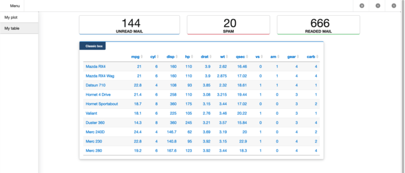
Tables – great when looking for exact values
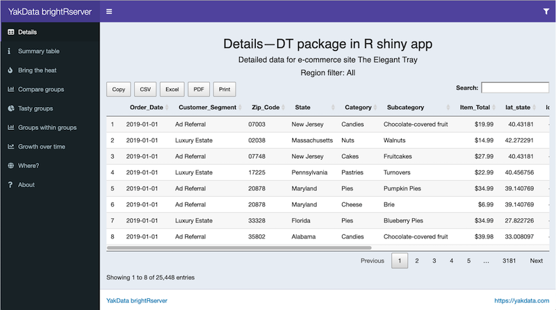
A DT table example, click this image to try the live example on YakData ConnectR
If you need to compare exact values with each other, start with a table. Businesspeople are usually very familiar with tables because they are in a spreadsheet format, like Excel.
Detailed tables versus summarized tables
There are two primary ways to think about using R to display data in tables: detailed, interactive reviews with the DT package and highly formatted, compact summaries of your data with the gt package.
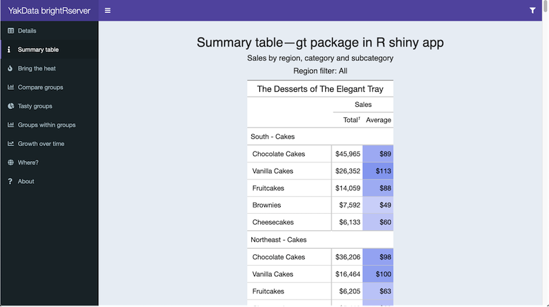
A gt summary table example, click this image to try the live example on YakData ConnectR
Highlight tables – help you quickly find extreme values in your data
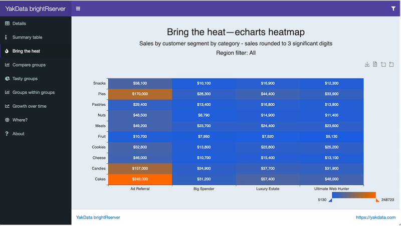
Highlight tables with echarts4r, click this image to try the live example on YakData ConnectR
If you would like to emphasize particular values in your table so that they are easy to find, turn the text table into a highlight table by shading or coloring the cells to quickly identify and examine the important values.
For instance, you’d like to find the months and product lines that had the highest profits in 2011. To be able to quickly find them, you highlight the profits: the higher the profit, the darker the shading.
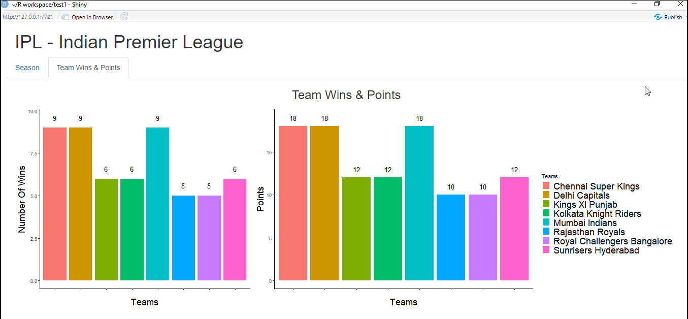
Basic bar charts – make it easy to compare across groups
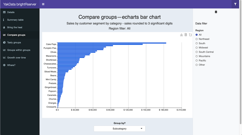
A bar chart example using echarts4r, click this image to try the live example on YakData ConnectR
If you would like to quickly compare a single metric or data item across multiple categories, use a bar chart or bar graph. The value of the metric is represented by the height or length of the bar.
Pie charts – quick relative comparisons
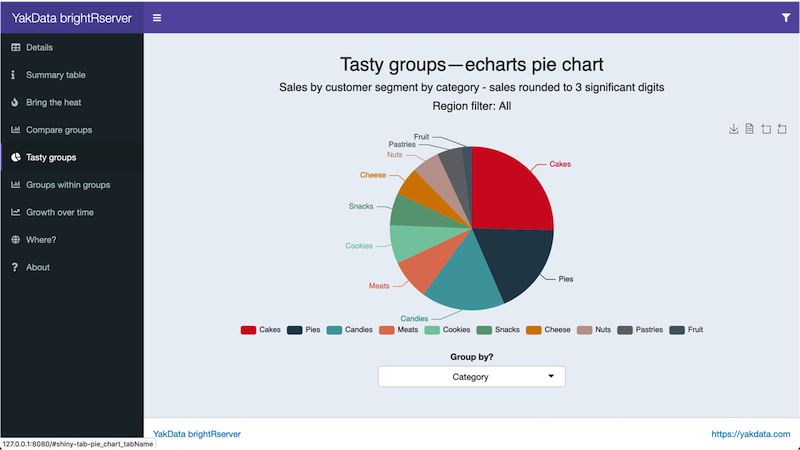
A pie chart example using echarts4r, click this image to try the live example on YakData ConnectR
Perhaps you would like to quickly compare a few categories to gain a rough sense of which categories are larger and smaller relative to the combined total for all categories, often called “percentage of the whole” or relative contribution. If the exact numbers are not important, pie charts are a commonly used alternative.
Stacked bar charts – compare across groups and within groups
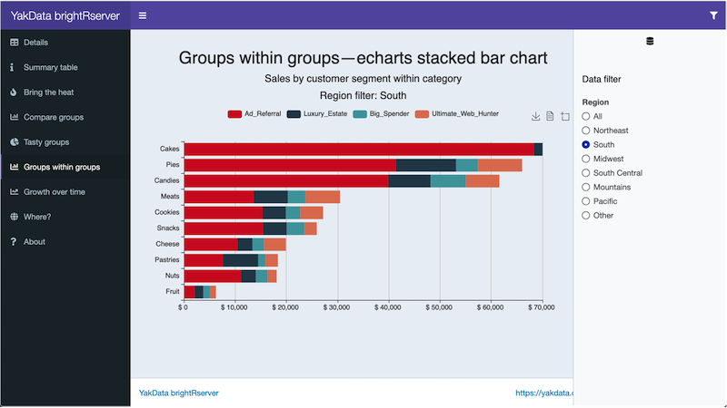
A stacked bar chart example using echarts4r, click this image to try the live example on YakData ConnectR
If you would like to compare actual values between primary groups, as well as actual values of the secondary grouping within each primary group, use a stacked bar chart.
Line charts – look at changes over time
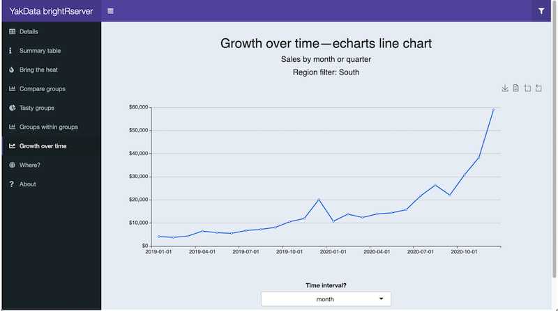
A line chart example using echarts4r, click this image to try the live example on YakData ConnectR
If you would like to investigate how a data item or multiple data items changed over a period of time, use a line chart. These are also referred to as a growth rate chart or time series.
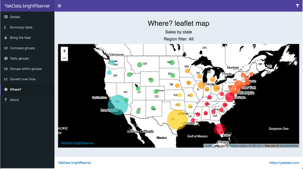
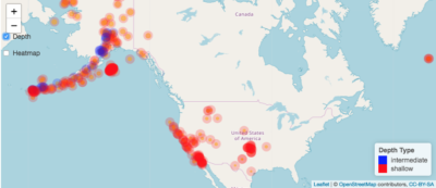
Map your data – show where the action is

A map example using leaflet, click this image to try the live example on YakData ConnectR
If location is crucial to the problem that you are investigating, display your key metrics on maps. Maps also provide a wow factor and excite your audience.
Smarter flow, messages and new tricks with JavaScript/jQuery
shinyjs is the preferred way to enhance your R shiny app dashboard with additional interactive capabilities in the browser. shinyjs simplifies the addition of JavaScript/jQuery operations to your dashboard.
Examples of what you can do with shinyjs include:
+ Hide or show an element on the page.
+ Disable or enable inputs.
+ Change/restore the value of an input.
+ Delay code execution.
+ Run JavaScript code on page load.
+ Create and execute on-demand your own JavaScript functions from the R server function in your shiny app.
A great tutorial to learn the core of shinyjs is at the package author’s website, Dean Attali. An example of advanced user feedback messages is shown below.
shinyjs adding feedback, from Dean Attali’s shinyjs advanced examples, click to visit
Every production R shiny app dashboard that I have developed has used JavaScript enhancements, usually with the use of shinyjs. On occasion, I had simpler needs that could be fulfilled with standard methods to add JavaScript to shiny apps without the addition of the shinyjs package.
One last consideration is building shiny apps with external HTML templates. Dean Attali has instructions on using shinyjs in this configuration. This can be quite time-consuming but allows the embedding of shiny capabilities with your web development standards.
![]()
![]()
![]()
By embedding your R shiny app dashboard as part of larger web development projects, amazing concepts can be achieved from a user workflow, data-sharing and dynamic feedback perspective in complex web/data/organizational environments. I have integrated R shiny apps with Vue.js web platforms using the HTML template approach. The results were indeed impressive. React JS and AngularJS integration/working in parallel with R shiny app dashboards is also possible.